【问题描述】
通过窗口移动平均可以对时间序列数据进行平滑处理。
【示例7-9】
本例使用的Excel文件的完整路径为“D:/Samples/ch07/03 数据平滑/数据记录.xlsx”。该文件打开后如图7-4所示,请使用窗口移动均值对数据进行平滑处理,窗口大小为3。用Matplotlib在同一个图中绘制平滑前后数据的折线图。

图7-4 试验数据
- 编写下面的代码:
code.python
import pandas as pd
import matplotlib.pyplot as plt
# 读取Excel文件
df = pd.read_excel('D:/Samples/ch07/03 数据平滑/数据记录.xlsx', engine='openpyxl', sheet_name=0, index_col=0)
# 使用窗口移动均值对数据进行平滑处理,窗口大小为3,忽略缺失值
smoothed_data = df.rolling(window=3, min_periods=1).mean()
print(smoothed_data)
# 绘制原始数据和平滑后数据的折线图
plt.plot(df.index, df.values, label='Raw Data')
plt.plot(smoothed_data.index, smoothed_data.values, label='Smoothed Data')
# 添加标题、标签和图例
plt.title('Data Smoothing with Moving Average')
plt.xlabel('Time')
plt.ylabel('Value')
plt.legend()
# 展示图像
plt.show()
打开Python IDLE,新建一个脚本文件,将上面生成的代码复制进去,保存。运行脚本,在IDLE Shell窗口输出平滑后的数据。
code.python
>>> == RESTART: D:/Samples/1.py =
                   数据
日期
2022-09-09  28.482375
2022-09-10  24.316723
2022-09-11  22.805820
2022-09-12  22.968928
……
同时显示用Matplotlib绘制的平滑前后数据绘制的折线图,如图7-5所示。图中兰色、上下波动比较大的是用平滑前的数据绘制的折线,橙色、上下波动小的折线是用平滑后的数据绘制的。可见,数据平滑效果比较明显。
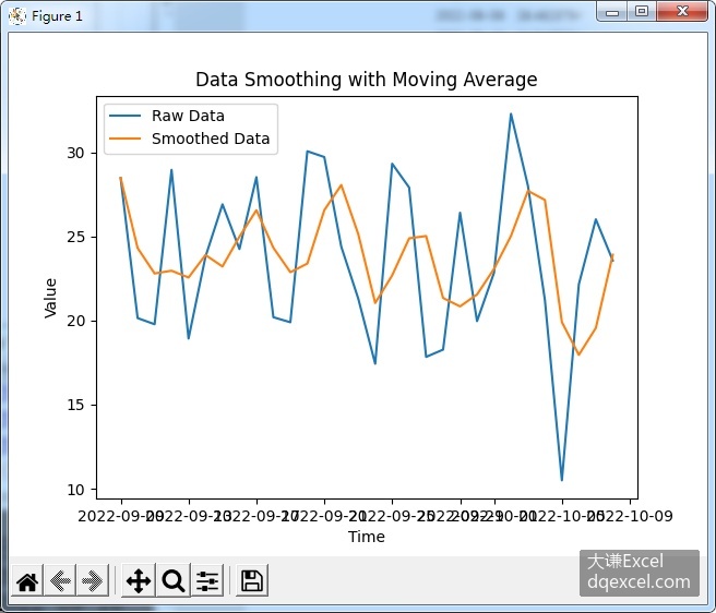
图7-5 平滑前后的数据对应的折线图
【知识点扩展】
pandas中可以使用窗口移动平均对时间序列数据进行平滑。方法是设定一个指定大小的可以上下移动的窗口,例如,如果窗口大小为3,则它覆盖时间序列数据中的连续3个数据。此时窗口中心的值取为窗口内所有数据的平均值。也常取窗口内数据的中值。